
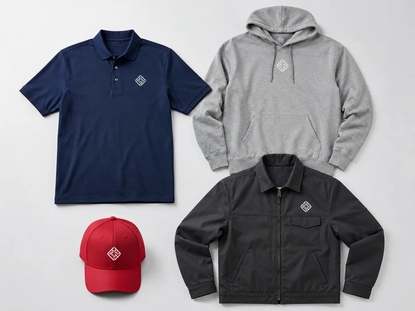
A good embroidered logo can still look wrong if it is too large, too small, too low, or placed too close to a zipper, pocket or seam.
That is why logo placement deserves just as much attention as thread colour, garment choice and digitizing.
For most embroidery projects, there is no single measurement that works perfectly on every garment. A logo that looks balanced on a men’s large polo may need to be adjusted for a fitted shirt, youth hoodie or curved baseball cap.
At MRAYLA Embroidery and Stitches in London, Ontario, we look at the logo, garment construction, embroidery area and intended use before deciding on final positioning.
This guide explains the most common embroidery placements, practical starting sizes and the situations where your logo may need to be adjusted.
Quick Embroidery Logo Placement Guide
The following measurements are useful starting ranges, not rigid rules.
Garment / PlacementTypical Starting SizeBest ForPolo or shirt – left chestAbout 3–4 in. wideBusiness uniforms, staff apparelHoodie – left chestAbout 3–4 in. wideStaff, schools, teamsHoodie – centre chestAbout 5–8 in. wideLarger brandingJacket – left chestAbout 3–4 in. wideCorporate and workwearJacket or hoodie – backAbout 8–12 in. wideHigh-visibility brandingCap – frontRoughly 3.5–4.5 in. wide and up to about 2–2.25 in. highBusiness, team and promotional hatsCap – sideRoughly 1–2 in. wideSecondary logo or initialsBeanie – front/cuffRoughly 2–3 in. wideBusiness and team brandingSleeveRoughly 2–3 in. wideSecondary logo, department or sponsorApron – upper chestRoughly 3–4 in. wideRestaurants, cafés and service businesses
These ranges can change depending on the proportions of your logo, garment size, seams, pockets, available embroidery area and how much detail must remain readable.
A professional embroiderer should always treat the garment itself—not just a size chart—as the final reference.
Why Embroidery Logo Placement Matters
Customers often focus first on what colour thread they want or how large they want their logo.
Placement can have an even greater effect on how professional the finished garment looks.
Move a chest logo too far toward the sleeve and it can appear to disappear under the arm. Put it too close to a polo placket and the entire front can look crowded. Place a large design too close to a hoodie pocket and there may not be enough stable fabric to achieve the intended result.
Good placement helps your logo look:
-
Balanced on the garment
-
Easy to recognize
-
Consistent across an order
-
Appropriate for the garment style
-
Professional when the garment is actually being worn
The key phrase is when it is being worn.
A garment lying flat on a table does not always look the same once it is on a person.
What Is the Best Placement for a Business Logo?
For professional staff clothing, left-chest embroidery remains one of the most versatile choices.
It works particularly well on:
-
Polo shirts
-
Work shirts
-
Quarter-zips
-
Jackets
-
Hoodies
-
Scrubs
-
Uniform shirts
A logo roughly 3–4 inches wide is a practical starting point for many adult garments.
But width alone does not tell the whole story.
Logo shape matters.
A wide horizontal company logo may need to be closer to 4 inches to keep the lettering readable.
A compact square or circular mark could look overly large at exactly the same width.
A tall logo presents another challenge because increasing its width also increases its height.
That is why we prefer to size embroidery based on the visual proportions of the actual artwork, rather than automatically making every business logo the same width.
For companies outfitting employees, our Custom Business Uniforms and Polos & Workwear services are designed around this type of professional branding.
Left-Chest Logo Placement on Polos
Polos are one of the most common garments we embroider for company uniforms.
The button placket creates a convenient visual centreline, but it also means placement must be balanced between the placket and the outside of the chest.
A typical adult left-chest logo is approximately 3–4 inches wide, with the vertical position adjusted according to the garment size, cut and logo height.
The objective is not simply to follow a measurement.
The objective is for the logo to look centred on the wearer’s chest.
Watch for these polo-shirt issues:
The placket
A wide logo positioned too close to the buttons can make the front look crowded.
Chest pockets
If the shirt has a pocket, we need to determine whether the logo should be embroidered above it, directly on it, or placed on the opposite chest.
Different garment sizes
A position that looks perfect on a large shirt may look too low or too far outside on a small shirt.
Logo proportions
A four-inch-wide logo containing very small lettering may still need to be simplified rather than simply enlarged.
For businesses ordering staff apparel, consistency across the entire size range is more important than blindly repeating one measurement on every garment.
Logo Placement on Hoodies and Crewnecks
Hoodies give you several good embroidery areas:
-
Left chest
-
Centre chest
-
Upper back
-
Full back
-
Sleeve
For professional staff apparel, the left chest is usually the safest choice.
For schools, clubs, teams and merchandise, a larger centre or back design can create more visual impact.
However, hoodies introduce additional obstacles that polos do not have.
Kangaroo pockets
On pullover hoodies, a large front design has to work around the kangaroo pocket.
Moving embroidery too low can crowd the pocket, while excessively large dense embroidery can make the front of the garment feel heavy.
Drawstrings and hood seams
The logo should visually balance with the neckline and hood.
Zip-up hoodies
A zipper divides the front of the garment.
For that reason, left- or right-chest embroidery is usually much simpler and cleaner than trying to embroider a large design directly across a zipper.
If you are ordering apparel for staff, a school, club or sports team, our Hoodies & Crewnecks service offers both smaller professional branding and larger custom designs.
How Large Should a Logo Be on a Hat?
Hat embroidery deserves its own treatment.
A baseball cap is a curved, structured object—not simply a small shirt.
A practical front-cap embroidery area is often around 3.5–4.5 inches wide, while logo height commonly needs to remain around 2–2.25 inches or less, depending on the particular hat.
But the actual cap determines the usable area.
Structured caps, unstructured dad caps, trucker hats and low-profile caps can all behave differently.
The same logo may need a different embroidery version for a hat.
This is important.
A logo that stitches beautifully at left-chest size may contain:
-
Lettering that becomes too small
-
Details that become difficult to reproduce
-
A shape that is too tall
-
Elements that do not stitch well across a curved cap
-
Stitch sequences better suited to a flat garment
Sometimes the right solution is not to force the entire logo onto the hat.
Instead, we might use:
-
The brand icon without the tagline
-
A shortened wordmark
-
Initials
-
A simplified version of the logo
-
A different layout designed specifically for headwear
-
That can produce a much cleaner result than shrinking a complex logo until nobody can read it.
MRAYLA’s Custom Hats & Beanies service includes front, side and back embroidery as well as options such as 3D puff for suitable designs.
Where Should a Logo Go on a Beanie?
Beanies present another challenge because the fabric stretches.
For cuffed beanies, the centre of the cuff is usually the most natural branding area.
A logo around 2–3 inches wide is a useful starting point, although wider simple wordmarks may work depending on the beanie.
The biggest mistake is trying to reproduce extremely fine detail on stretchy knit fabric.
Simple artwork, readable lettering and appropriate digitizing normally produce a cleaner result.
Another option is an embroidered patch attached to the beanie instead of stitching the full logo directly into the knit.
This can work particularly well for detailed logos or brands looking for a different visual style.
Is Sleeve Embroidery a Good Idea?
Yes—especially as secondary branding.
Sleeves can work well for:
-
Company initials
-
Small icons
-
Sponsor logos
-
Canadian flags
-
Department names
-
Team marks
-
Anniversary dates
For many garments, a sleeve logo around 2–3 inches wide provides enough visibility without overpowering the primary chest logo.
A common business combination is:
Left chest: company logoSleeve: secondary mark, certification or department
For teams and clubs, the sleeve can also carry a sponsor or organizational mark while the main team crest remains on the chest.
What About Large Back Embroidery?
Large back embroidery can look impressive on:
-
Jackets
-
Hoodies
-
Crewnecks
-
Workwear
-
Team apparel
But bigger is not automatically better.
As embroidery becomes larger, stitch count and weight can increase considerably.
Design size, stitch count and garment choice can also affect embroidery pricing, especially for larger or more detailed logos.
A large area filled with dense thread may make the garment feel stiff and may not be the best decoration method for the artwork.
This is one of the situations where a responsible embroidery provider should tell you when embroidery may not be the ideal solution.
Large lettering or a relatively open design may work beautifully.
A huge photograph-like image with extensive filled areas may be better suited to another decoration method.
The purpose should determine the method—not the other way around.
If you are considering a large design, compare embroidery versus screen printing to understand which decoration method may be better for your artwork and intended use.
How Do Pockets, Seams and Zippers Affect Placement?
A placement diagram cannot see your actual garment.
That is why these features have to be inspected before production.
Pockets
A pocket may occupy the ideal embroidery location or make it difficult to access the fabric correctly.
If keeping the pocket functional is important, the production approach needs to account for that before embroidery begins.
Zippers
Zippers divide the garment and can prevent conventional centre-chest placement.
Heavy seams
Thick seams may interfere with hooping or prevent the embroidery area from sitting evenly.
Jacket construction
Interior pockets, linings and waterproof layers can affect how a jacket should be embroidered.
This is why we recommend choosing the garment and the embroidery placement together whenever possible.
Should the Same Logo Size Be Used on Every Garment Size?
Not always.
Suppose a business needs polos from XS through 3XL.
Using the exact same logo size throughout the order may produce acceptable consistency for many designs—but the visual proportion still needs to be checked.
Youth garments almost always deserve additional attention.
A logo designed for an adult large can easily overpower a youth shirt.
The same applies to school and team orders that include several garment types and size ranges.
Our goal is visual consistency:
The branding should look like it belongs on every garment, even when the garments themselves are different sizes.
That sometimes requires scaling or repositioning.
Small Lettering Is Often More Important Than Overall Logo Size
One of the most common misunderstandings about embroidered logos is assuming:
“If the logo fits, it can be embroidered.”
Not necessarily.
Your artwork may physically fit inside the available area while some of its details are too small to reproduce cleanly in thread.
Potential problems include:
-
Tiny taglines
-
Hairline strokes
-
Small reversed lettering
-
Intricate outlines
-
Fine gradients
-
Very tight spacing
Embroidery is made from physical thread.
There is a practical limit to how small a stitch and piece of lettering can remain recognizable.
When necessary, we may recommend removing a tagline, increasing the overall size or preparing a simplified embroidery version of the logo.
That is not changing your brand.
It is adapting the artwork so your brand actually looks good in thread.
Does Digitizing Affect Logo Placement?
Absolutely.
Digitizing converts artwork into instructions that tell the embroidery machine how the design should be stitched.
It controls elements such as:
-
Stitch types
-
Stitch direction
-
Density
-
Underlay
-
Pull compensation
-
Colour sequence
-
Trims
The garment itself affects those decisions.
A logo destined for a stable polo does not necessarily require exactly the same treatment as one going onto a stretchy beanie or curved baseball cap.
This is another reason we recommend deciding on garment, size and placement before final production rather than treating digitizing as a simple file conversion.
How We Approach Logo Placement at MRAYLA
At MRAYLA Embroidery and Stitches, standard placement measurements are our starting point—not the final decision.
Before stitching, we consider:
-
The garment type
-
Garment size
-
Logo dimensions and shape
-
Text readability
-
Fabric characteristics
-
Seams, pockets, zippers and construction
-
Intended viewing distance
-
Whether the item is part of a larger uniform or team order
The goal is simple:
Your logo should look like it was designed for the garment—not added as an afterthought.
For repeat business orders, establishing an approved placement also makes future reorders more consistent.
Which Embroidery Placement Should You Choose?
If you are unsure, these are good starting points.
Professional business uniforms
Choose a left-chest logo on polos, work shirts, jackets, quarter-zips or hoodies.
Construction and trades
Use left-chest branding for identification, with optional back or sleeve branding for increased visibility.
Restaurants and cafés
Consider left-chest polos, apron chest embroidery and hats.
Schools and sports teams
Use left chest, centre chest, sleeves, hats and back placements depending on whether the garment is a uniform, warm-up piece or spirit wear.
Promotional hats
Use a strong, simplified front-cap logo, with smaller secondary embroidery on the side or back if desired.
Premium corporate apparel
Subtle left-chest embroidery on a polo, jacket or quarter-zip usually creates the cleanest presentation.
Frequently Asked Questions About Embroidery Logo Placement
What is the most common place for an embroidered business logo?
The left chest is one of the most common placements for professional uniforms, including polos, shirts, hoodies, jackets and scrubs. It keeps the branding visible without dominating the garment.
How big should a left-chest embroidered logo be?
Approximately 3–4 inches wide is a useful starting range for many adult garments. The best size depends on the logo’s proportions, lettering and the garment itself.
Can I use the same embroidery design on a polo and a hat?
Sometimes, but not always. Caps have a curved embroidery area and different construction, so a left-chest logo may need to be resized, simplified or digitized differently for headwear.
Should youth clothing use a smaller logo?
Usually. A logo sized for an adult garment may look oversized on youth apparel, so size and placement should be checked proportionally.
Can you embroider over a pocket?
It may be possible, but the garment construction and whether the pocket must remain functional need to be considered first.
Can you embroider a large logo on the back of a hoodie?
Yes, depending on the design and garment. However, very large, densely filled embroidery can become heavy or stiff. We may recommend adjusting the design or using another decoration method when appropriate.
What if I don’t know which placement looks best?
That is completely normal. Send us your logo and tell us what type of garments you are considering. We can recommend a practical size and placement before production.
Get Your Embroidery Placement Right Before the First Stitch
Good embroidery begins before the machine starts running.
Choosing the right size and placement helps your logo look balanced, readable and professional on everything from business polos and workwear to hoodies, team apparel, hats and beanies.
If you’re planning an embroidery project in London, Ontario or elsewhere in Canada, MRAYLA Embroidery and Stitches can help you determine the garment, logo size and placement that best suit your design.
Whether you need one custom item or apparel for an entire business, school, team or organization, send us your logo and project details through our Request a Quote page.
You can also explore our custom embroidery portfolio to see completed apparel, hats, patches and workwear projects.
We’ll help you figure out what will work before the first stitch is made.